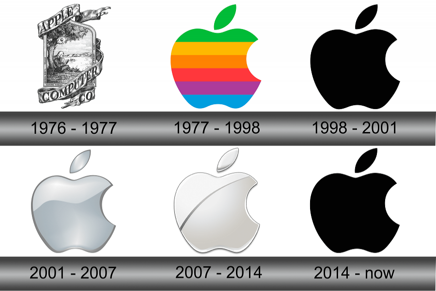
The Apple company is known to everyone as the iPhone maker. They earned themselves a global reputation as the most valuable company in the world. However, there's an interesting story behind their log.
One of the biggest companies in the world, with a capital of almost 2.8 trillion dollars, has a very distinct logo - a half-eaten apple that is one of the most familiar logos in the world. But did you know the apple was not always half-eaten?
The logo of the Apple company was not always the half-eaten apple we see nowadays. It came across much evolution. In the beginning, the logo was Newton sitting under an apple tree, and an apple is just about to fall. This very moment captured was the logo of Apple in 1977.
Ronald Wayne designed this very first logo. Newton, with a book in his hand, the company name written in a ribbon wrapping around the image, the logo was a piece of art.
But this logo did not express anything about the company. The founder of this multinational company, Steve Jobs, also thought that the logo was backdated and failed to depict the company’s motive and functionality. So the logo was proposed to change. Jobs hired an experienced logo designer.
In 1977, Rob Janoff designed the half-eaten apple logo for the first time. Though back in those days, it was multicoloured like a rainbow. It was used in Apple II computers. Apple II computer is the world’s first colour display computer.
In an interview, the designer was asked why the apple was half-eaten. He replied that it distinguished the apple from the cherry or tomato.
This answer did not convince people. There indeed, was more to it. Rob mentioned that the phone logo shows anyone can experience it, like a bite of an apple.
Have you noticed how similar bite and byte sound? A byte is a very small unit of data. Some say that the bite in the logo was made keeping the homophones in mind to create a buzz among computer enthusiasts.
In 1986, there arose a conflict within the company of Apple. This resulted in the kick out of the founder, Steve Jobs. But the company couldn’t function without him. It was proven when Apple almost went bankrupt in 1997. Jobs was brought back.
After coming back, Jobs tried to rebrand the company and clear its image. He made changes to the company, including the logo. The rainbow logo was changed to translucent sky blue, then a solid black logo.
A few more changes happened, including going from a glass-themed logo to a simple flat design. This logo is known to all and has gained worldwide popularity.
Besides the history of evolution, if we go back to the initial thought of the half-eaten apple, some more theory exists. Some people say Eve’s bite inspires it out of the apple. Some say it was inspired by Nymphus eating the golden apple and gaining immortality.
Again, the father of modern computers, Alan Turing, died eating a poisoned apple. None of these theories have strong leads, yet they prevail.


